Serious FileMaker Pro® Development. Tic-Tac-Toe: A Challenge of Unspoken Requirements
In a recent FileMaker Pro software development stress-relieving exercise, our FileMaker Pro developers were offered a simple challenge to create a Tic-Tac-Toe software game using FileMaker Pro while following a few basic requirements:
- The Quality must be apparent in the user interface. It doesn’t have to look stunning…just clean, consistent, fun and professional.
- Creativity should be apparent behind the scenes. Step out of your normal routine and challenge yourself to use techniques demonstrating modern advancements in your development platform. Try to complete the task with as few fields, scripts, and table occurrences as possible, while still maintaining a structure that’s reasonably approachable by an average FileMaker developer.
- Games will be played by a single user against the computer. The computer can make the first move of each game, and must at least be smarter than choosing the next move by random selection of available spaces.
- Use of X and O is the norm, what fun can we have using other images?
This limited scope for such a well-known game could allow plenty of time for creative techniques, and would likely result in similar solutions…or so we thought!
Only three developers were up to the challenge; Andy Persons (Sr. Lead FileMaker Pro Developer), Doug West (Project Manager), and Ken Moorhead (Sr. Lead FileMaker Pro Developer). Each of these FileMaker Experts demonstrated not only different techniques in achieving the goal, but also significantly different interpretations of the requirements. Here’s an overview of the concepts you will discover in the accompanying files:

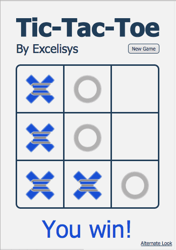
Andy: Minimalist’s Spin on a Classic
No fields, no custom functions, one layout (plus a bonus alternate view), and less than a dozen scripts are all it takes for what you would typically expect of a Tic-Tac-Toe game against a formidable opponent. In the first layout, merge variables are used to display the appropriate letter in each cell of the grid. In the alternate view, each cell of the grid contains separate tab panels with three tabs; “blank”, “x”, and “o”. The tabs are named in a consistent way that allows use of the Go to Object script step to toggle the view accordingly.

Doug: Winning’s Not an Option
No fields, no custom functions, one layout (plus an intro screen), and only one script make this a pretty lean package. This is achieved through script parameters, global variables, conditional formatting, and a strict interpretation of the requirements. The computer always starts by playing the top left corner before the user is given a turn. This simplifies the possible game states to allow a manageable list of known board configurations and the corresponding move to ensure the computer cannot lose. Graphics are stored on the layout as fill images in the background of text regions. Conditional formatting makes the unwanted images disappear when appropriate.

Ken: What the Client Hinted, But Didn’t Really Say
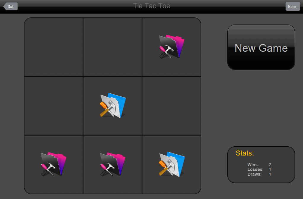
This thing has it all! Here you’ll find custom menus, 13 custom functions, a few tables, 30+ fields, and nearly 30 scripts. Ken’s experience has taught him that “when a client starts talking about user interface at all, they CARE, so be sure to give interface design adequate attention.” This inspired a variety of layouts allowing the game to be played from web browsers via Instant Web Publishing (IWP), on iPads and iPhones in FileMaker Go, and, of course, in the standard FileMaker Pro. With user-configurable options for the level of difficulty and the tokens used in place of the old-school X and O, there’s enough flexibility to please the whole family.
Our internal FileMaker Pro development contest guidelines specifically encouraged the use of “as few fields, scripts, and table occurrences as possible.” Files from Andy and Doug held this as a core principle. However, Ken’s file veered away from this guideline in favor of providing features typically expected in a marketable solution. Is there a right and a wrong? Do you include features in your FileMaker Pro development solutions that you’re confident users will want, even if they haven’t asked for them?
Sharpen your pencils, hone your skills, and give these files a try. After you’ve battled your way through each, tell us your favorite feature and weigh in with your guess on which submission won the in-house vote for grand prize. Download the file. Download pdf of the full article.

![[FMP Tip-n-Trick] Integrating A.I. with FileMaker for Marketing Research](https://excelisys.com/wp-content/uploads/2025/08/ai-research-assistant-capture-500x383.png)
![[FMP Tip-n-Trick] FileMaker Pro Audit Trail “Refined”](https://excelisys.com/wp-content/uploads/2025/03/fmp-audit-trail-refined-500x383.webp)


Leave A Comment